Chronicle Trek
A hospital wayfinding app that interfaces with electronic health records, designed for pharmacy technician trainees

CLIENT
Personal Project
TEAMMATES
Just me!
TIMELINE
Side project while working
SKILLS
Design process, wireframing, prototyping, stakeholder mapping, systems analysis, storyboarding, ideation, competitive analysis
OUTPUT
High-res designs, basic prototypes
TOOLS
Figma, Photoshop
Background
ABOUT PHARMACY TECHNICIANS
Pharmacy technicians do most of the grunt work around the pharmacy. In retail settings they type in and count out prescriptions, answer phone calls, and work the sales register. In hospital settings they organize and deliver drugs to the medication dispensing machines and nurses throughout the hospital, as well as make and deliver IVs and answer messages and phone calls. Because of their mobility in delivering medications all throughout the hospital, an internal map of the hospital floor plan is required for safe and timely medication delivery.
PROBLEM SPACE
Based on my own observations, experiences as a trainee, and experiences training new trainees, pharmacy technician trainees often struggle to learn the floor plan of a new hospital.
With the healthcare staffing crisis and the rise of travel healthcare jobs, where workers are placed into different hospitals for contracts lasting a few months to a year, learning the floor plan of each hospital becomes a barrier to mastery of the job in each hospital and increases the risk of adverse events.
Glatter, R., Papadakos, P., & Shah, Y. (2023, June 30). American health care faces a staffing crisis. Time. https://time.com/6291392/american-health-care-staffing-crisis/

CHALLENGE
How might we assist pharmacy technician trainees in navigating new hospital layouts?
Surveying the topic
SYSTEMS ANALYSIS
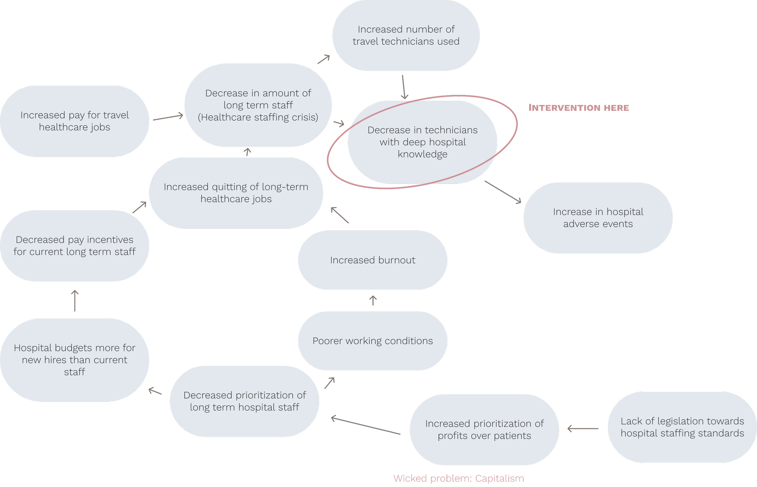
Based on my own experience, I built a map trying to elucidate loops in the factors that affect this issue. Using tips from Sheryl Cababa’s book Closing the Loop: Systems Thinking for Designers, I tried to figure out what was causing increases or decreases in the factors in each step and how they influenced one another. I didn’t find a full loop, but with more time and actual interviews I’m sure this map could go so much deeper.
KEY TAKEAWAYS
We’re not going to solve for capitalism, but we can intervene downstream while keeping in mind the bigger picture.
Designing something to increase deep hospital knowledge will not only help the travel technicians, but also new long term staff, which will always be needed. Decreasing hospital adverse events is the goal.
Ideation
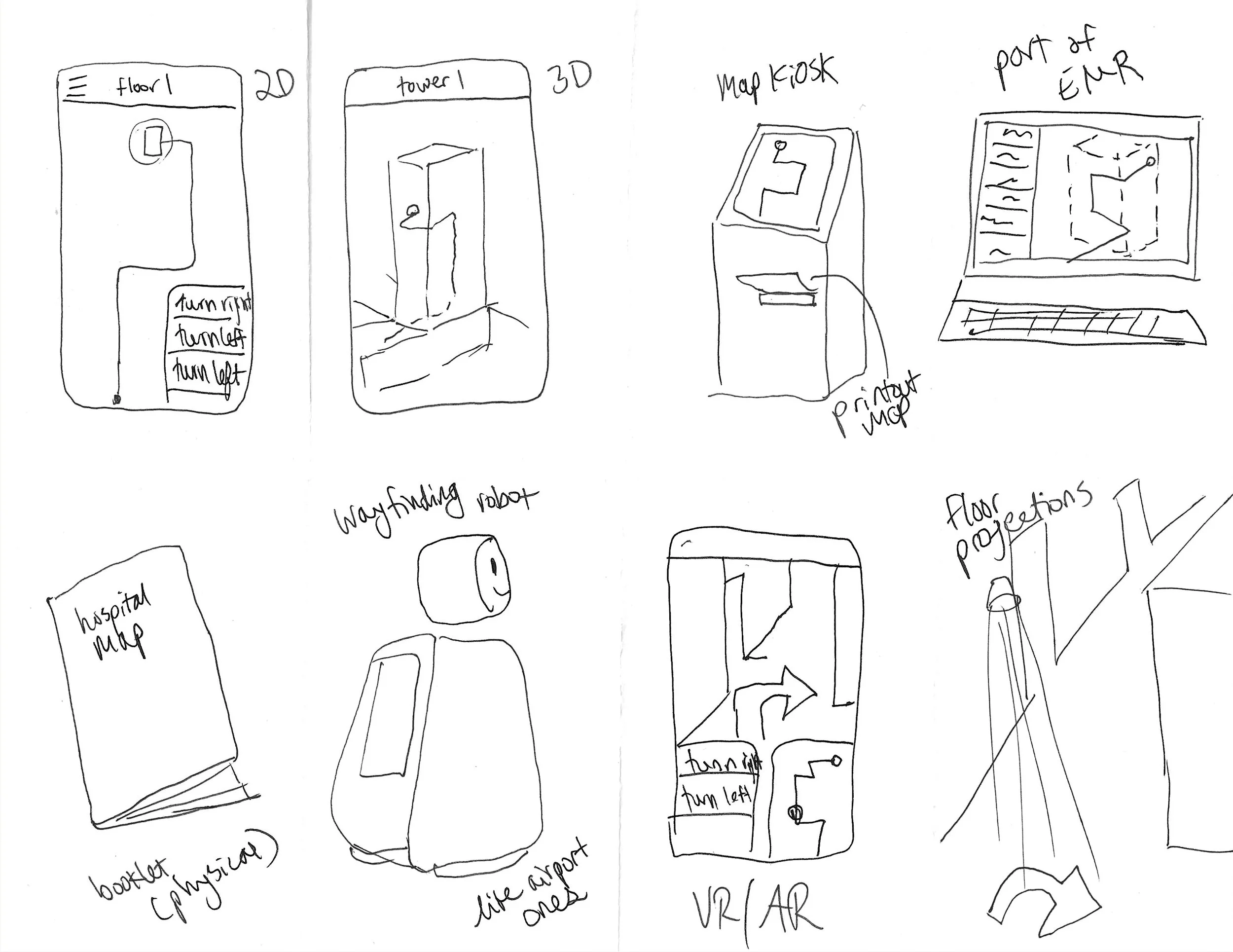
CRAZY EIGHTS EXERCISE
To generate ideas, I performed a Crazy Eights exercise. I then downselected to the map app idea.
The reason for selecting the app concept is that hospitals often already use staff mobile devices to interface with the electronic health records and keep in contact with other providers within a HIPAA compliant platform, so adding another function to that seems the most reasonable, rather than building entirely separate devices (like kiosks.)
NAME
I wanted this product to live within a larger electronic health record (EHR) ecosystem, so I invented a fictitious EHR called Chronicle, with the map application function named Chronicle Trek.
DESIGN PRINCIPLES
To further guide my designs, I created four central design principles:
Simple
Designs perform the function they need to, with no extra fluff
Seamless
Designs work hand in hand with the system and make sense to the user intuitively
Standard
Designs don’t try to completely reinvent the wheel, they do the expected functions
Compassionate
Designs are human-centered and sensitive to user needs
STAKEHOLDER MAP
In order to get a sense of who exactly I was designing for, I created a stakeholder map. This helped me center the very narrow group of pharmacy technician trainees, with the idea that this design could also assist other people or have other people with an interest in it.
Design
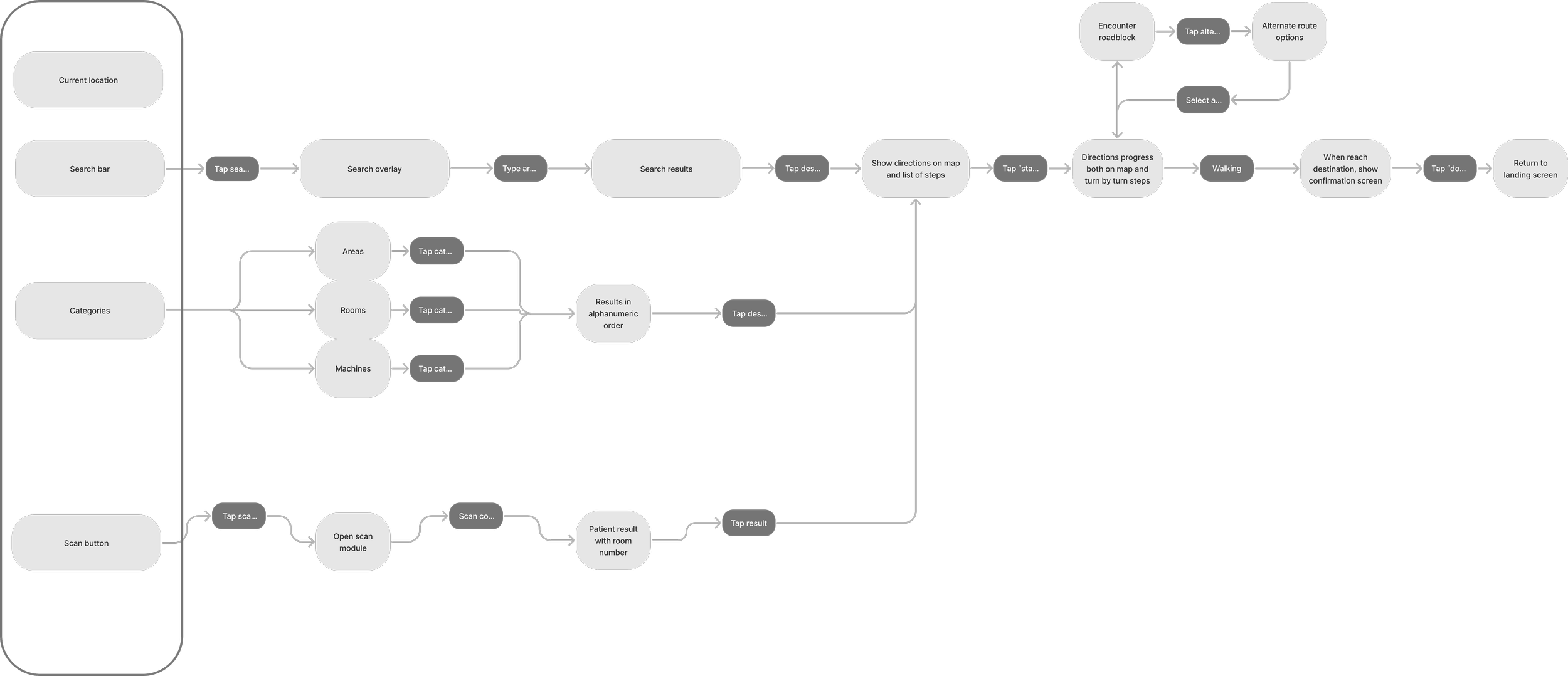
USER FLOWS
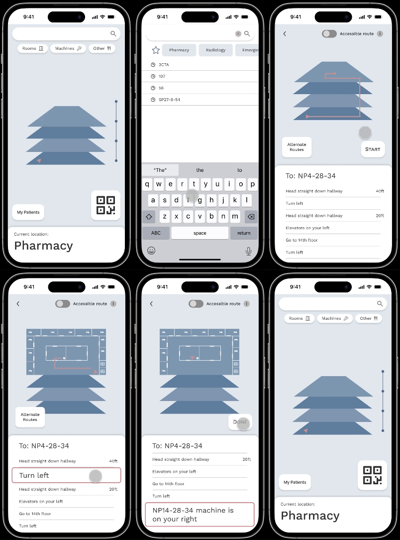
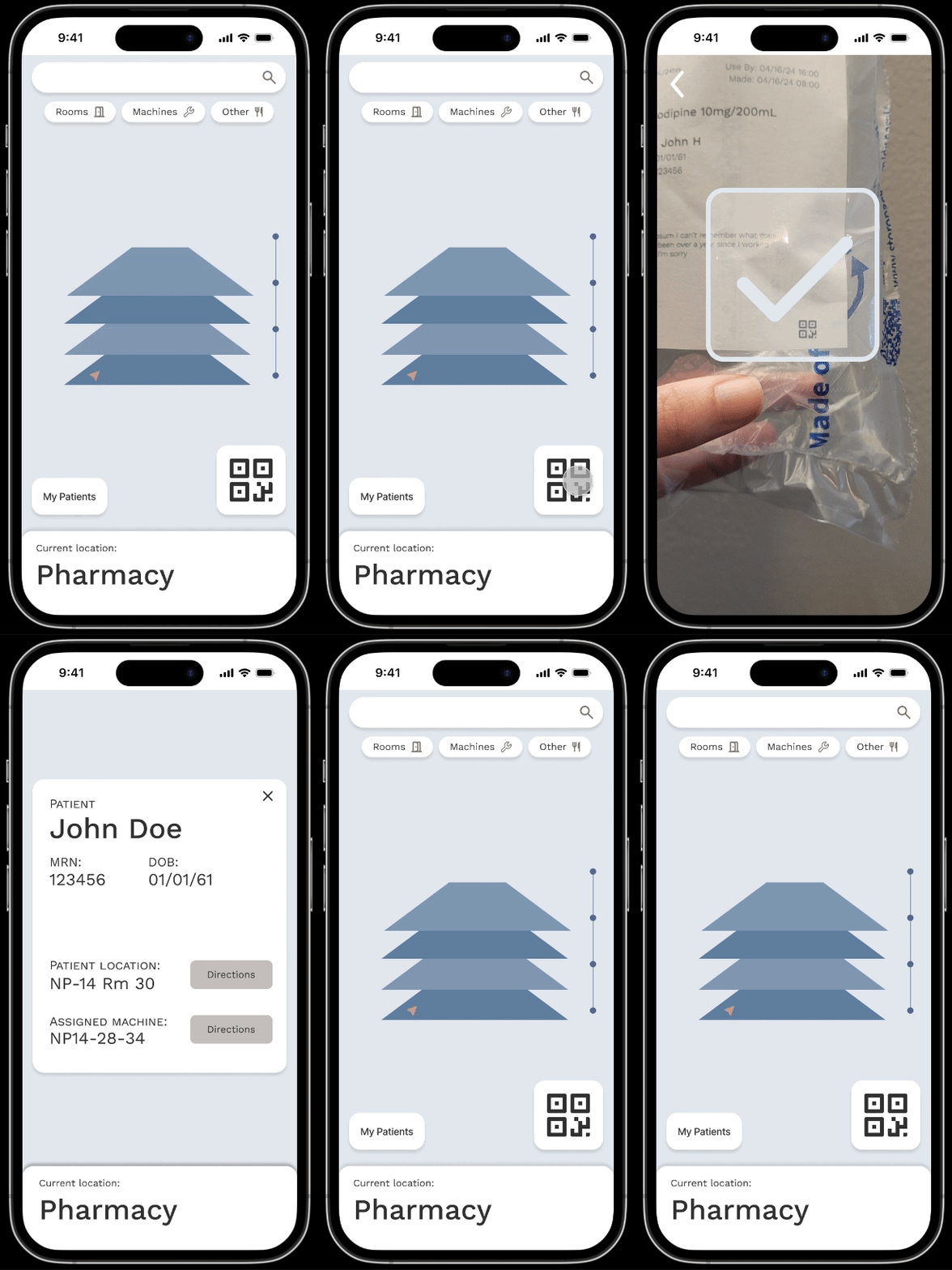
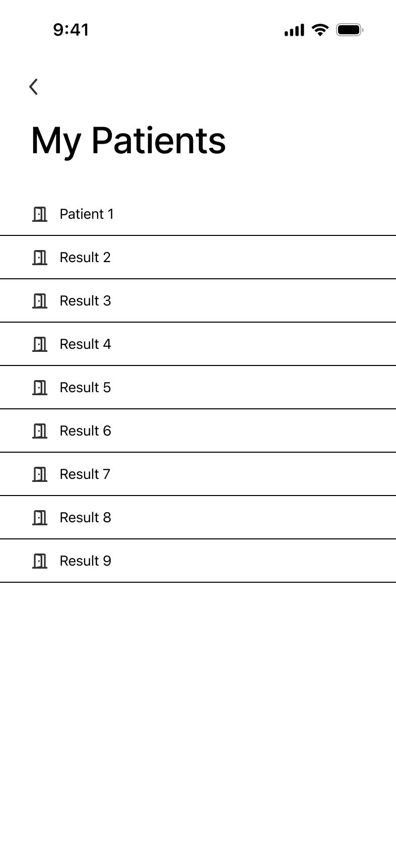
To guide my designs, I made a series of user flows to organize what screens I needed. There are three main flows, all originating from the home screen, plus a simple patient list flow that I added later on.
WIREFRAMES
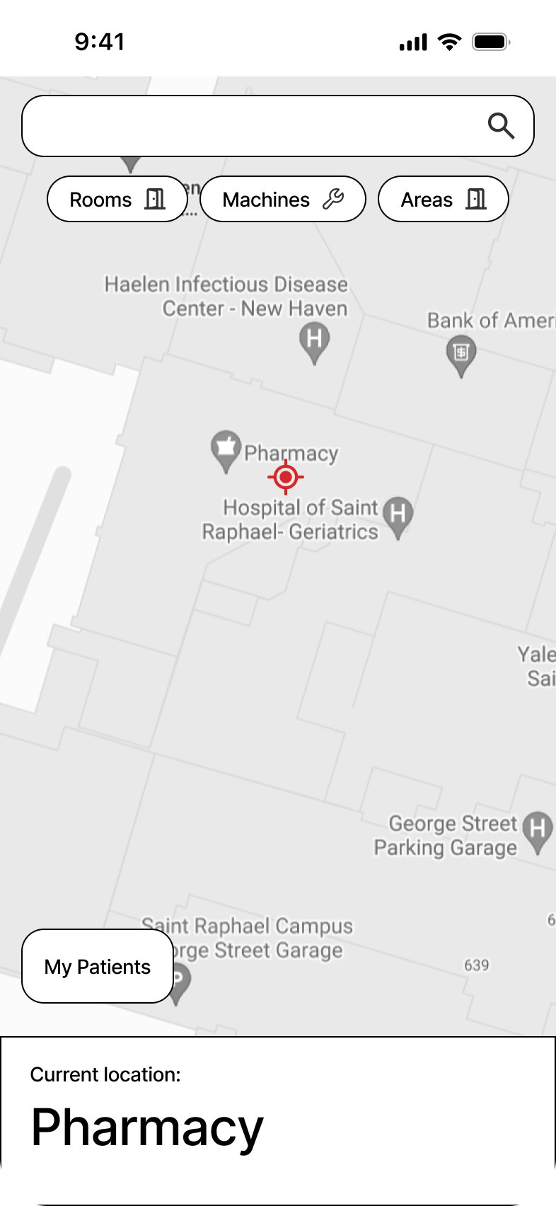
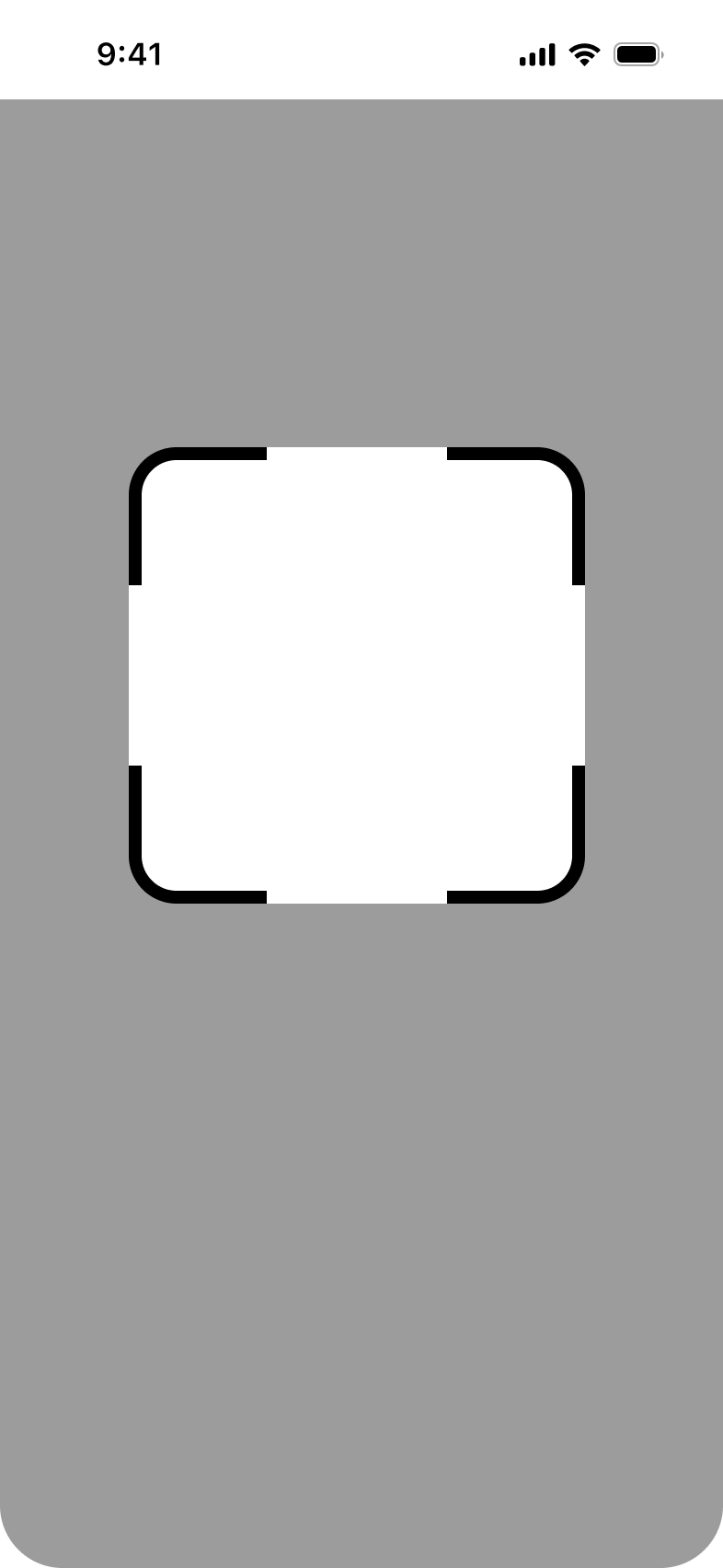
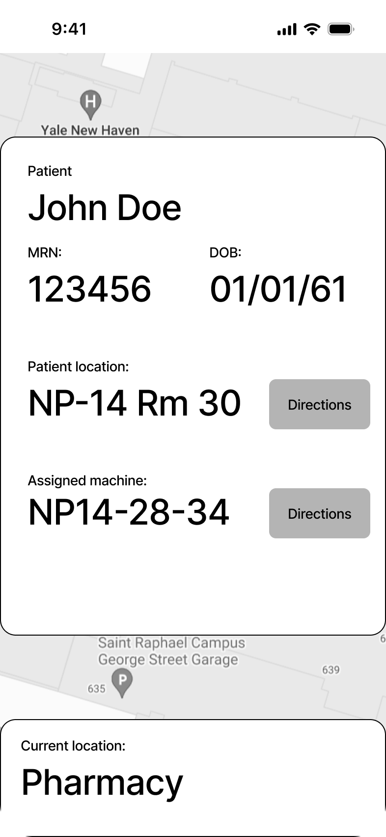
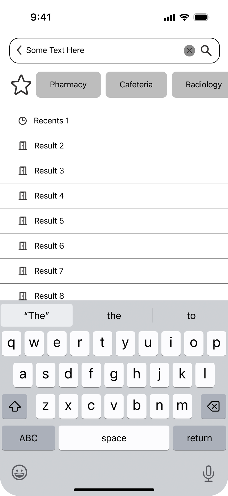
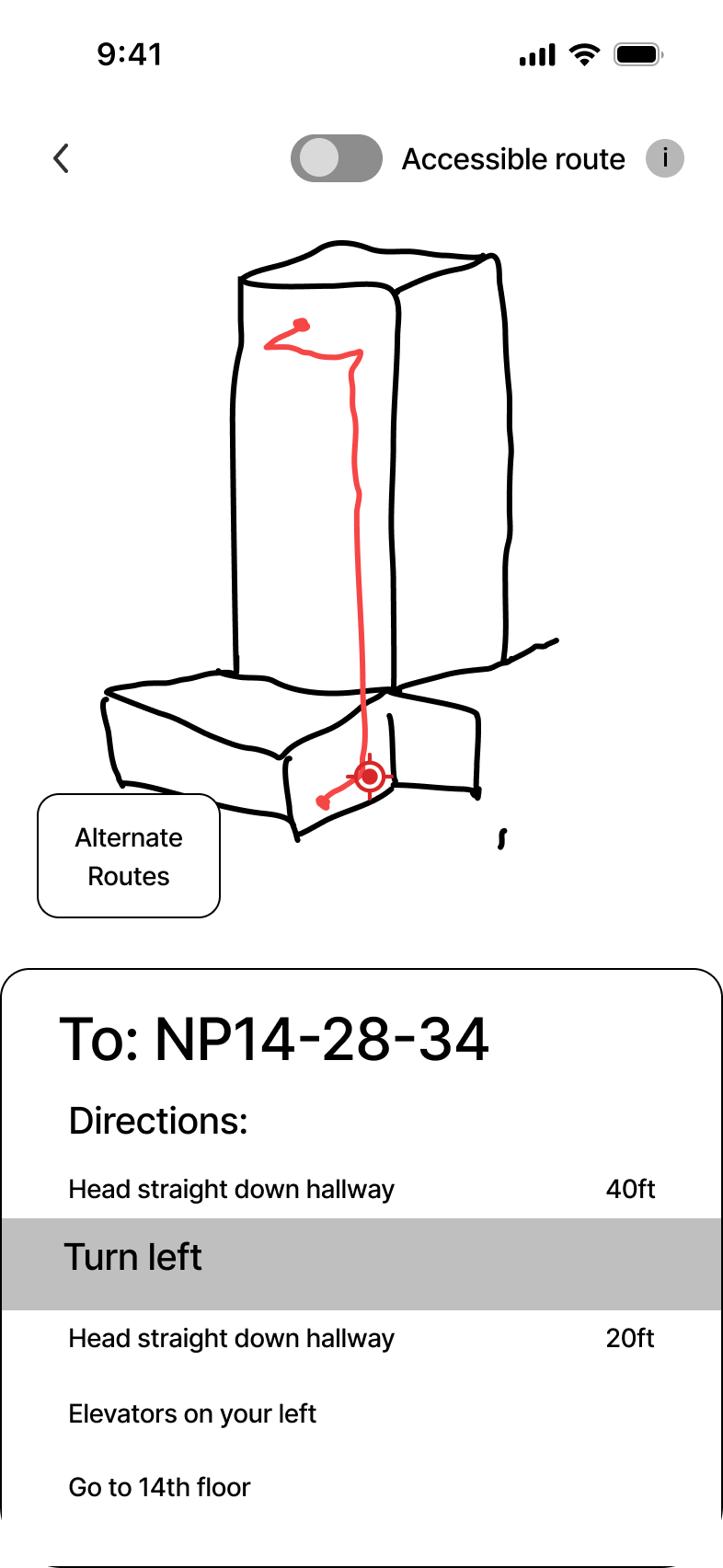
I then created a series of wireframes to further refine and guide my vision for the design. I made a small component library to make my design process easier.
I also prototyped them in Figma to check if the flows made sense.
DESIGN SYSTEM
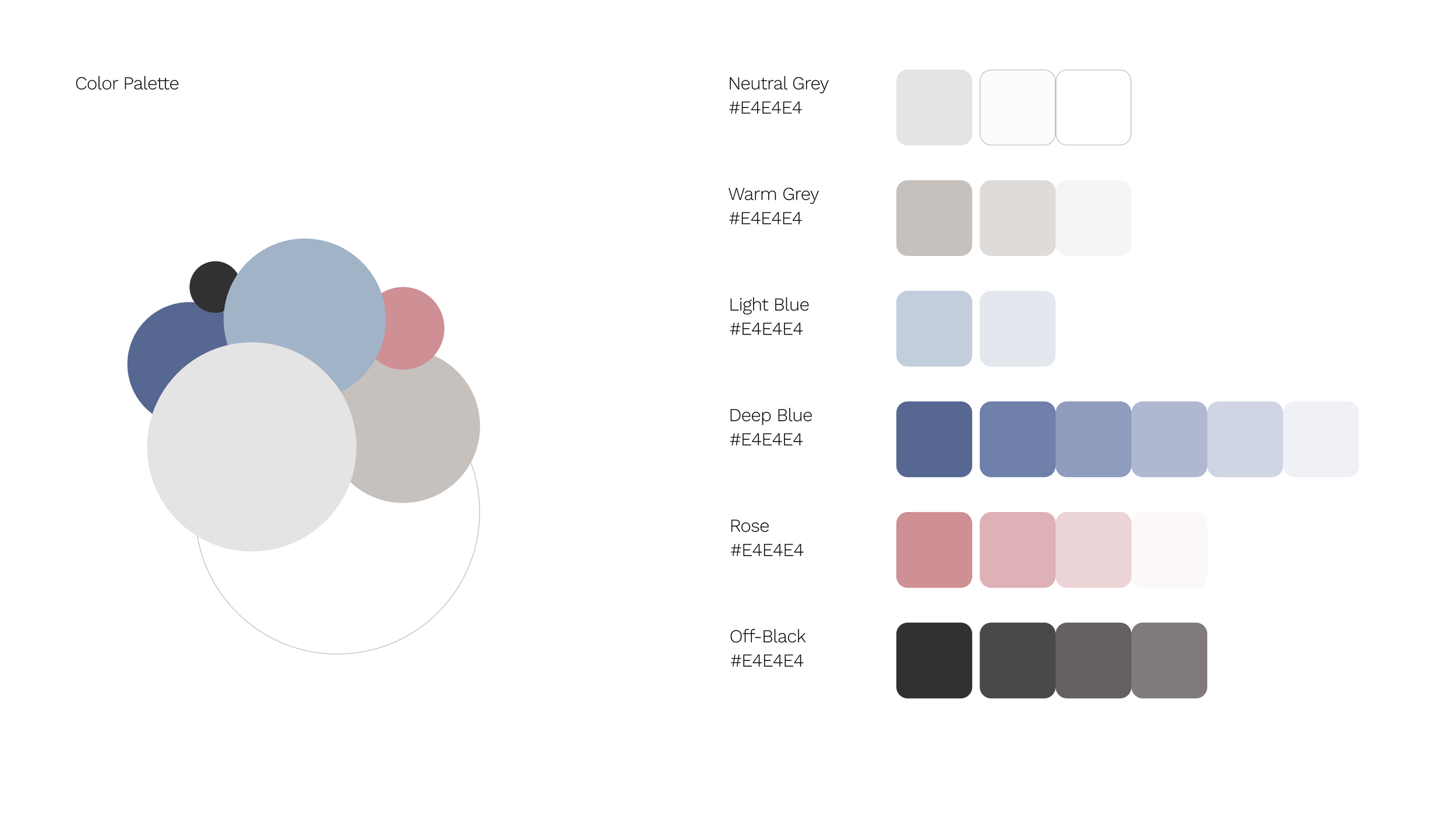
Before diving into the high-fidelity mockups, I put together a simple design system to guide my process. I wanted to use blue as a calming color that is also commonly associated with healthcare. Using the moodboard as a guide, I picked a rose color as an accent to the blue. I wanted this app to have a “light mode” feel, so as not to feel too intimidating.
Output
PRODUCT
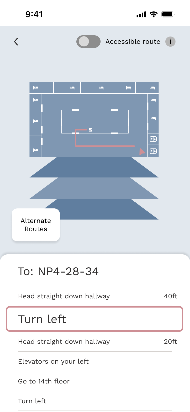
For my final designs, I followed (and adjusted) the design system and “upgraded” the wireframes to their final versions.
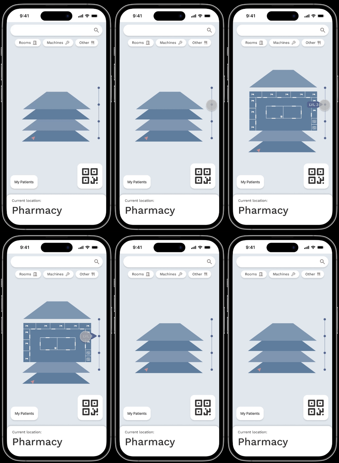
One major sticking point was the 3D map view. I decided against a detailed mockup like the wireframes implicated, since it seemed unnecessarily complex. I simplified the 3D view to a stack of floor plans, so that technicians can get a mental map of the building as a whole and the floor plans within them, without the complexity of a full 3D mockup.
I then ran my designs (and whole design process) through some designer friends who gave me a few tweaks to make and then I considered myself done.
Reflection
REFLECTION
This is a project that has been in my head since before I ever started learning UX design, and it feels good to finally get it out on paper. I do wish I had more skills to make a more polished and professional product, but as I’m still a beginner I don’t want to be too hard on myself. This was a good experience to see what I can do on my own, outside of a group setting, as well as areas I need to improve. Specifically, I could use some practice with high-fidelity designing and more complex prototyping.
GOING FORWARD
If I find the time to continue working on this project, I would love to refine the prototypes even more and iterate on the final designs. They are not as polished as I pictured them in my head, and I would love to come back to this project after gaining some more skills and see what I can do. I would also love to add some more user flows that I wasn’t able to include in this first pass, like rerouting directions or a “training” mode that guides you to memorizing the hospital layout. There’s a lot of potential to flesh out this design.

